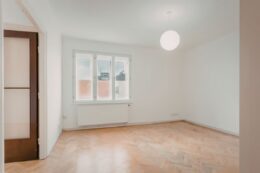
Color palette comparison is the process of testing different color combinations before applying them to an interior space. It helps designers understand how wall colors, flooring, furniture, textiles, lighting, and decorative elements work together.
In interior design, color is not only a visual choice. It affects contrast, spatial perception, material balance, and how a room feels under different lighting conditions. Comparing palettes before final selection helps reduce uncertainty and supports clearer design decisions.
Why Color Palette Comparison Matters
Color often defines the first impression of a space. It can make a room feel calm, warm, spacious, refined, or more intimate depending on the tones used. Because of that, interior designers usually compare several palettes before moving forward.
Understanding color psychology in interior spaces can also help designers choose palettes that support a specific mood, whether the goal is to create a calm bedroom, a welcoming living room, or a more focused workspace.
Looking at options side by side helps reveal undertones, contrast levels, and how colors interact with flooring, fabrics, furniture, and finishes. A palette that looks balanced on its own may feel flat or overly busy once materials are introduced. Comparing early also helps avoid expensive repainting or replacement decisions later.
Light changes everything. Natural daylight, artificial lighting, ceiling height, and room size all influence how a color is perceived. A soft beige may feel warm in one room and dull in another. Testing palettes in context leads to more confident, better-informed design choices.
Color palette comparison helps designers answer practical questions:
- Does the palette work with the existing materials?
- Does it support the intended atmosphere?
- Does it create enough contrast?
- Does it feel balanced with the furniture and flooring?
- Does it suit the room’s function and daily use?
- Does it stay consistent under different lighting conditions?
When these questions are tested early, the final design direction becomes easier to justify and communicate.
Main Elements of a Color Palette
A practical interior color palette usually includes several layers. Each layer has a different function in the space.
Base Color
The base color is the dominant color in the room. It is often used on walls, large surfaces, or major architectural elements. Neutral colors such as white, beige, gray, and warm off-white are common base colors because they can support many material and furniture choices.
Secondary Color
The secondary color supports the base color and creates visual structure. It may appear in furniture, curtains, rugs, cabinetry, or larger decorative elements. This color usually helps define the design direction more clearly.
Accent Color
The accent color is used in smaller areas to create contrast or emphasis. It may appear in cushions, artwork, lighting fixtures, small furniture, or decorative objects. Accent colors should be used carefully because too many strong accents can weaken the overall palette.
Material Colors
Material colors come from wood, stone, metal, fabric, tile, and flooring. These colors are not always selected from a paint chart, but they strongly affect the palette. For example, oak flooring, black metal frames, brass fixtures, or marble veining can change the overall color balance of a room.
Best Color Palette Combinations for Interior Design
There is no single best color palette for every interior. The right combination depends on the room’s function, natural light, furniture, materials, and the mood the designer wants to create. However, some palette directions are especially useful when comparing options during the early design stage.
Warm Neutrals With Natural Wood
Warm neutrals such as beige, cream, taupe, and soft greige work well with oak, walnut, or light wood finishes. This combination creates a calm and welcoming atmosphere, making it suitable for living rooms, bedrooms, and open-plan interiors.
Soft Whites With Muted Greens
Soft whites paired with sage, olive, or muted green tones can make a room feel fresh, balanced, and natural. This palette works well in kitchens, bathrooms, bedrooms, and interiors that aim for a relaxed, organic mood.
Beige and Terracotta Tones
Beige, sand, clay, and terracotta tones create a warm, earthy palette with more character than a simple neutral scheme. This combination is useful for interiors that need warmth, depth, and a subtle Mediterranean or natural-inspired feeling.
Light Grey With Black Accents
Light grey combined with black accents can create a clean, modern, and structured look. It works especially well when balanced with warm wood, textured fabrics, or soft lighting so the space does not feel too cold or flat.
Earthy Tones With Natural Materials
Earthy palettes can include warm browns, muted greens, stone tones, clay shades, and off-whites. When combined with linen, wood, stone, rattan, or textured fabrics, they help create a grounded and timeless interior.
Dark Modern Palettes With Lighter Textures
Dark palettes using charcoal, deep brown, navy, or dark green can make a space feel dramatic and refined. To keep the room from feeling heavy, designers often balance these tones with lighter fabrics, warm lighting, reflective surfaces, or natural textures.
When Should Designers Compare Color Palettes
Designers should compare color palettes early enough to influence the overall direction, but not so early that the room’s function, materials, and furniture choices are still unclear. The best time is usually during the concept and material selection stages, before final approvals or purchasing decisions are made.
Color palettes are especially worth comparing when:
- defining the overall mood of the room
- choosing between warm, cool, light, or dark design directions
- reviewing flooring, wall colors, fabrics, and furniture finishes together
- preparing visual options for a client presentation
- checking how colors respond to natural and artificial light
- making final decisions before painting, ordering materials, or buying furniture
Comparing palettes at these stages helps designers avoid late changes and gives clients a clearer understanding of how each color direction will affect the final space.
6 Ways to Compare Different Color Palettes
Interior designers can compare color palettes in several ways, depending on the stage of the project. Early methods help define the overall mood, while detailed checks make the final palette more reliable. The strongest approach usually combines room purpose, material samples, lighting review, and visual testing.
1. Start With the Room’s Purpose
A color palette should support how the room will be used. Bedrooms usually work better with calm, soft, and restful tones, while living rooms can handle warmer, more social, or more expressive palettes.
Kitchens and bathrooms often need cleaner and more functional color schemes. Fresh neutrals, soft whites, muted greens, or balanced contrast can help these spaces feel bright, practical, and easy to maintain.
2. Compare Warm and Cool Palettes
Warm palettes include tones like beige, sand, cream, terracotta, taupe, and warm wood shades. They can make a room feel welcoming, relaxed, and more intimate.
Cool palettes include soft whites, greys, blues, greens, and cooler stone tones. They often create a calmer, cleaner, or more spacious feeling. Comparing warm and cool options helps designers decide whether the room should feel cozy, fresh, grounded, or open.
3. Test Light and Dark Color Schemes
Light palettes can make smaller rooms feel more open and airy. They also reflect more light, which helps in compact spaces or rooms with limited daylight.
Darker palettes add depth, contrast, and a more dramatic atmosphere. They can work well in larger rooms, dining areas, powder rooms, or spaces where a stronger visual statement is needed. The key is to balance dark tones with texture, lighting, and lighter materials so the space does not feel heavy.
4. Review Materials and Furniture Together
Colors should not be judged alone. Flooring, wood tones, upholstery, stone, tile, fabrics, and metal finishes can all change how a palette feels.
A wall color that looks elegant on a sample may clash with warm oak flooring or feel flat next to grey upholstery. Metal accents also matter. Brass, chrome, black, and bronze each shift the overall mood of the palette.
5. Compare Options in the Actual Room Context
Mood boards and samples are useful, but they do not always show how a palette will behave in the room. Designers should test colors with the actual room size, natural light, ceiling height, window direction, and existing furniture in mind.
Digital mockups or visual previews can help compare multiple options from the same angle. Keeping the same lighting and viewpoint makes the comparison more accurate.
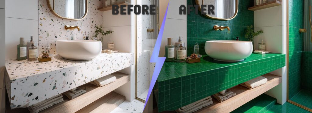
6. Use AI-Based Visualization for Faster Exploration
AI-based visualization can help designers compare color palettes quickly by generating different versions of the same room. It is useful for testing wall colors, flooring tones, furniture finishes, or full style directions before moving into final documentation.
The best results come from clear instructions. For example, the designer can ask the tool to keep the layout, windows, flooring, and furniture placement unchanged while testing a new color palette. AI visualization is useful for early comparison, but final decisions should still be checked against real samples, paint codes, materials, and lighting conditions.
Common Mistakes When Choosing a Color Palette
Even a strong color idea can feel wrong when it is applied without considering the full room. The most common mistake is ignoring lighting conditions. A soft beige, warm white, or muted green can look completely different in natural daylight, artificial lighting, or a north-facing room.
Another mistake is following trends without context. A popular color palette may look beautiful online, but it still needs to match the room’s size, furniture, flooring, and overall interior style.
Using too many competing colors can also make a space feel visually busy. A stronger approach is to choose one main color, one or two supporting tones, and a few accent colors that add depth without overwhelming the design.
ArchiVinci: How It Supports Interior Design Workflows
Since color palette comparison often depends on visual testing, AI-based tools can help designers review multiple directions faster and with more context.
ArchiVinci is an AI-powered architectural visualization platform built for fast, accurate, image-based rendering. It helps interior designers, architects, and design teams turn sketches, room photos, floor plans, 3D model screenshots, and existing images into clear visual concepts.
Its core strength is render precision. ArchiVinci can preserve model geometry, material textures, surface details, and room structure while generating photorealistic visuals in around 5 seconds, without requiring GPU setup.
The platform also supports a wide range of design needs, including interior rendering, exterior visualization, editing, upscaling, variations, animation, rotated views, real estate furnishing, lighting studies, masterplans, and floor plans.
Key ArchiVinci Modules
- AI Interior Design Generator
- AI Exterior Design Generator
- Exact Render Generator
- Modify Room Generator
- Virtual Staging AI
- Floor Plan to 2D
- Floor Plan to 3D
- Masterplan Coloring
- Render Enhancer
- Render Animation Generator
How ArchiVinci Can Help Compare Color Palettes?
Interior designers can upload an existing room photo, sketch, or 3D model screenshot and test different color ideas before making final design decisions. Instead of relying only on swatches or mood boards, they can generate realistic interior visuals that show how each palette may look in context.
For example, designers can compare warm neutrals, soft earthy tones, dark modern palettes, or light minimalist schemes on the same room layout. Because ArchiVinci keeps geometry, textures, and surface details consistent, it becomes easier to see how wall colors, furniture tones, flooring, materials, and lighting work together.
They can also create multiple palette variations quickly, review them side by side, and choose the direction that feels most balanced for the space.
Pricing Options
ArchiVinci offers monthly, yearly, short-term, and team plans. Its monthly plan is $79/month, while the yearly plan is $549/year, equal to $46/month when billed annually. Both include unlimited ArchiVinci Engine renders, which can be useful for testing multiple color palettes and interior design directions.
Final Thoughts
Comparing color palettes is not only about choosing attractive colors. It is about understanding how tones, materials, lighting, furniture, and room function work together. By testing options early, interior designers can make clearer decisions and present stronger visual directions to clients.
For designers who want to move beyond static mood boards, AI-based visualization tools such as ArchiVinci can make palette exploration faster, more realistic, and easier to compare before final selections are made.
Frequently Asked Questions
How many color palettes should interior designers compare before choosing one?
Interior designers usually compare a few strong palette options before making a final decision. In most projects, 3 to 5 palettes are enough to explore different moods, contrast levels, and material combinations without overwhelming the client.
What is the 60-30-10 rule in interior color palettes?
The 60-30-10 rule is a common interior design guideline for balancing colors in a room. The dominant color covers most of the space, the secondary color adds structure, and the accent color is used in smaller details to create contrast and interest.
Can the same color palette work across different rooms?
Yes, but it usually needs small adjustments. The same palette can create a consistent look across a home, while slight changes in shade, contrast, or accent colors can help each room feel appropriate for its size, lighting, and function.
How can designers tell if a color palette has enough contrast?
A balanced palette should create clear separation between walls, furniture, flooring, and decorative elements. If the space feels flat or the main features blend together, the palette may need stronger contrast through darker tones, lighter surfaces, or textured materials.
How often should color palettes be updated during an interior design project?
Color palettes may change as materials, furniture, lighting plans, or client preferences become clearer. It is common to refine the palette during concept development, but major changes should be avoided once final materials and finishes are approved.
What should be included in a professional interior color palette presentation?
A professional color palette presentation should include the main color direction, supporting tones, accent colors, material references, furniture finishes, and example room visuals. This helps clients understand both the aesthetic and practical use of each color.
Are neutral color palettes always the safest choice?
Neutral palettes are flexible, but they are not automatically the best option for every space. A neutral scheme still needs contrast, texture, warmth, and material balance to avoid looking flat or unfinished.