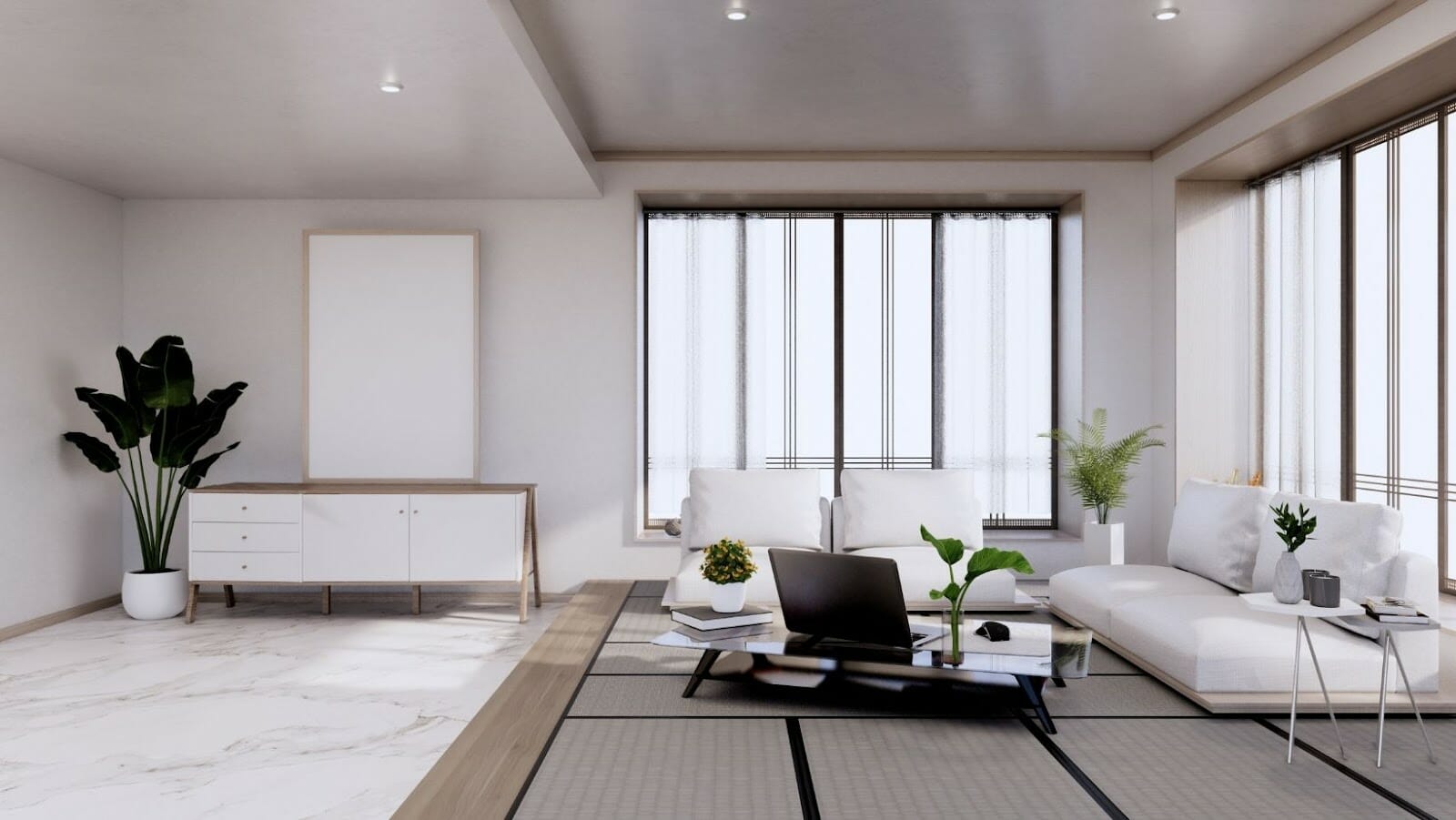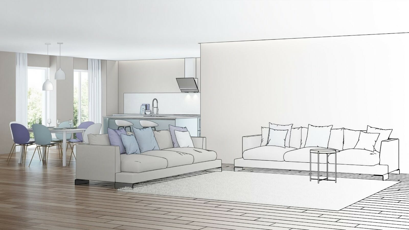
Do you often use 3D rendering for interior design presentations? It is undoubtedly one of the most effective tools for interior designers. But what if this genius tool becomes counterproductive! Before dwelling deep into that, let’s understand why interior designers use 3D rendering.
Relevance of 3D Rendering for Interior Designing
You must’ve noticed clients often found themselves lost in your passionate explanation of their dream home. Your technical jargons and drawings fall flat on their ears. This can be dangerous for your equation with the client and can even generate discord between you and the client.
3D rendering helps gauge the buyer’s attention with the project’s more profound and richer details. The clients understand the design from every perspective. They give their go-ahead with more confidence in your capability. 3D rendering aids in faster approvals as well.
However, the kind of details 3D rendering projects involve, they can easily go wrong if not done perfectly.
8 Common 3D Rendering Blunders
Following are the 8 most common 3D rendering mistakes that cause problems for interior designers. Ensure you check these mistakes whenever someone submits a 3D rendering project to you.
1. Unappealing Design
3D rendering aims to make a room come alive with all its objects. But designers often make the mistake of making a too simple design. Such renders only include room and window, which is not enough to impress the client. Always add some elements to make the design attractive.

2. Repetitive Details
Some artists are wise to include elements in their designs. But these elements, such as people and objects, are often downloaded. It makes them common as other artists are also using the same. If your clients are going through multiple presentations, this repetition distracts them from your interior design quality.
3. Unnatural Reflection
Ask any artist about the biggest challenge of 3D rendering for interior design, and they will mostly say creating a natural reflection. A perfect structure looks unnatural and deceptive with reflection. Hence, it’s essential to add imperfections such as dust or scratches to defuse the light and make the model look realistic.
4. Poor Texture Quality
Textures grab the client’s attention towards the detailing of your design. The render looks flat and plastic if textures are not added in the correct definition. At the same time, things go wrong if you make the texture look perfect. The artist needs to remember that texture is required to add the human touch and not attain perfection.
5. Wrong Lighting
Light bounces are responsible for the appearance of shadows in a render. Fewer bounces make the shadow too dark, and more bounces brighten the shadow. You don’t want both in your interior design. So check that your designer doesn’t skip light bounces to save time or include too many and add an unrealistic look.
6. Wrong Perspectives
You definitely lose your client by presenting a render with the wrong perspective. It can ruin the most beautiful interior designs, and 3D renders. And the wrong perspective is challenging to fix. It takes a lot of time and energy. So it would be best to alert your 3D artist to not lose the perspective at the beginning of the 3D rendering project itself.

7. Too Futuristic Look
There’s a difference between modern, futuristic, and too futuristic design. If you create a too futuristic or too advanced 3D render, your clients won’t be able to relate to it. Why would they invest their money and time in the interior design they don’t understand? Keep your design modern but relatable.
8. Lack of Functionality
If your 3D rendering doesn’t reflect functionality, your hard work goes in vain. The artist needs to have clarity about the unique requirement of every 3D rendering project to create suitable interior visualization. For instance, a 360 panoramic view is good for evaluating a restaurant’s design but not required for a home design.
Parting Words
These mistakes can prove to be costly. Always check your renders multiple times before presenting them to the client. Also, work with someone with good software skills and experience to avoid these and other common pitfalls of 3D rendering.
Realistic designs that are free of these design flaws make a good presentation, resulting in conversion.


