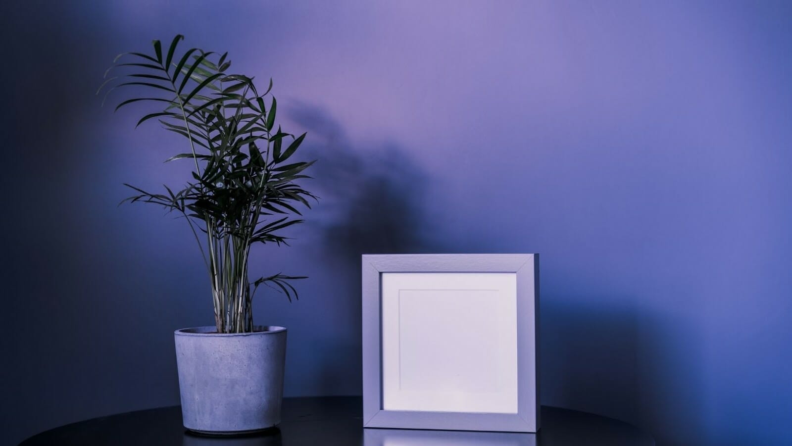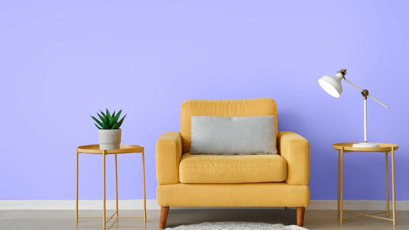
Very Peri, officially PANTONE 17-3938 Very Peri, is the Color of the Year 2022. Showcasing a periwinkle blue hue with a violet red undertone, the new color of the year is soothing, playful, and feminine.
“The Pantone 17-3938 Very Peri is a symbol of transformative times. As we emerge from an intense period of isolation, our physical and digital lives have merged in new ways. Very Peri reflects the global zeitgeist of the moment, the expanding possibilities in the digital world, and new trends in Igaming. This Color of the Year is a great way to express a spritely, joyous attitude and a dynamic presence that inspires creativity and imaginative expressions”.
Leatrice Eiseman, Executive Director of the Pantone Color Institute.
One thing’s for sure: Leatrice’s statement is spot on, and we couldn’t agree more. Very Peri is equal parts lively and tranquil, making it an ideal color to incorporate into any space and add a burst of design ‘oomph.’
Here are five ingenious ideas to use Pantone’s Very Peri for your home design.
Add a Dash of Very Peri to Your Interior Walls
In the wake of two grueling years of the pandemic, periwinkle makes a daring painting to induce hope and add a lighthearted tone to your interior walls.
Admittedly, it’s not the perfect shade for coating the entire house. But when applied in small doses, it’s the ideal pick-me-up shade for livening up home interiors.
Start by painting the walls of a powder room with shades of periwinkle. You can also use it to accent your Kitchen Island or base cabinetry.
If you are ready to go full throttle, paint the ceiling in your living room or hallway to draw up eyes. The light periwinkle hue will add a refreshingly bright pop of color to your home’s interior walls.
Make a Statement with Very Peri Anchor Patterns
Why not hit two birds with one stone by combining Very Peri with other statement-making accents? Incorporating this vivid hue into items like a large piece of drapery fabric or artwork can make a beautiful statement in a modern apartment.
Be sure to use statement accents that incorporate a bit of Very Peri. Everyday items such as a punchy sofa, storage rack, or even an area rug and throw pillows can generally go well with the periwinkle hue.
Furthermore, the color would totally fit within a jewel-tone scheme in shelving, library, built-ins, or bonus room cabinetry. This is a great way to introduce an eclectic vibe to a modern space without a massive commitment.
Bring a Vivid Blue Vibe to a Basement
Just because the basement is the lowest part of the building doesn’t mean it has to look like a low-spirited cave. Designers recommend painting a basement with a lively color like Very Peri.
The Very Peri’s blue tint adds a touch of warmth to the basement, and with its violet and reddish undertone, it’s sure to leave the tongues wagging.
To make the basement sophisticated without being overwhelming, we suggest pairing accents of Very Peri with subtle gray and white or muted tones. Doing this creates a touch of “eye candy” for your basement.
Experiment with Very Peri Outdoors
As a warm iteration of blue, Very Peri can energize a gloomy exterior and make your home stand out from the street. Use it as an accent color on the front door, trim, or shutters.
Again, moderation goes a long way. You don’t want to paint the entire exterior of your home a shade of blue and red-violet. Your best bet is to start small so that if you don’t like it, it’ll be easier to change it up.
We suggest going bold with a color similar to Very Peri or toning it down with a shade of gray. What this means is that a little pop of periwinkle should be enough to add some major appeal.

Match Very Peri with Nature-Inspired Hues
There is no shortage of ways to experiment with a lively blue shade of periwinkle. Because this shade is often seen in flower gardens, it’s no surprise that it goes well with other colors plucked from nature.
Try matching periwinkle with a vase of indoor flowers with a similar color palette, such as sky blue and spring green, for an easy, serene look.
If you want to create a moodier effect, go for deeper shades like cobalt and forest green. Accenting with deeper colors prevents periwinkle from shouting and creates a cohesive look.
Enliven Your Home with Pantone’s Color of the Moment
Pantone’s 2022 color of the year embodies several auras. Very Peri-inspired color creates an energetic, cozy, and romantic vibe. And that’s the kind of vibe your home should exude post-pandemic.
Don’t be afraid to play with this lively hue however you want. But just remember that Very Peri may be overwhelming if used all over the room.
Start small, and if you do like the color, consider making Very Peri a part of your color scheme. Good luck!


