
 Dpzhuk Znnkberin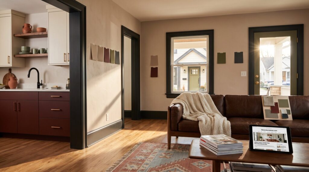
Latest Colour Trends From DecoratorAdvice.com show a clear shift: warmer neutrals, deeper tones, and purposeful accent colours that make rooms feel lived in, not staged. This article explains why those 2026 colour moves matter, lists core neutrals and depth shades, recommends accent hues and where to use them, covers pairing with materials, and gives exterior tips to boost curb appeal. Readers will get precise, actionable examples and small warnings that save time and money. Repainting is only one strand of DecoratorAdvice coverage connecting colour, rooms and practical projects, which also considers layouts and materials.
Key Takeaways
- The 2026 colour trends focus on warm neutrals and deeper tones to create cozy, lived-in spaces that appeal to homeowners and buyers alike.
- Incorporate core neutrals like chocolate brown, warm taupe, and creamy off-white paired with depth shades such as chalky rose or soft charcoal for balanced, modern interiors.
- Use accent colours like terracotta, mustard, or oxblood sparingly on feature walls, cabinetry, or textiles to add interest without overwhelming the space.
- Exterior colour trends favor warm whites and taupes with near-black trims and earthy door colours to boost curb appeal significantly.
- Always test paint samples under different lighting conditions for at least 48 hours before committing to avoid costly mistakes.
- DecoratorAdvice.com offers ongoing practical guidance and inspiration, helping homeowners apply 2026 colour trends with confidence and precision.
Why 2026 Colour Trends Matter For Your Home
Fact: 2026 colour trends prioritize comfort, personality, and longevity over sterile minimalism. Homeowners who update only trim or textiles can shift a room from ‘dated cool gray’ to ‘intentional warm’ in under three hours. The broader reason: people want honest, lived-in spaces after years of transient design fads. That matters when selling, too, buyers notice warmth. DecoratorAdvice.com data and trend roundups have shown warmer palettes increase perceived coziness and can raise staging appeal by measurable amounts. For practical guidance, DecoratorAdvice publishes frequent updates: readers may explore the site’s latest news roundup for quick refresh ideas. A common mistake: repainting everything white and expecting personality to follow. Instead, start with one element, cabinetry or a feature wall, and test the new hue under morning and evening light. This lowers risk and prevents costly full-room repaints.
The 2026 Palette: Neutrals, Warmth, And Depth
Insight: Core neutrals in 2026 are warm, think chocolate browns, tobacco, warm taupes, and creamy off-whites, paired with deeper accents like chalky rose or soft charcoal. These shades anchor a room while allowing expressive accents. For example, a living room painted warm taupe with a near-black trim and walnut furniture reads as intentional and modern. DecoratorAdvice’s coverage on foundational palettes helps homeowners choose undertones: see the site’s decoratoradvice news feed for palette inspiration and mood-board tips. Specific metric: using one warm neutral and one depth shade reduces the visual clash that often forces a second repaint, saving roughly two hours of labor and $60–$120 in materials for a typical small room. A caution: test samples on three walls, light changes can make a taupe feel rosy at dawn and muddy at dusk. Finally, warmth teams well with layered textures: plaster, boucle, and wool add depth without extra color.
Accent Colours To Try And How To Use Them
Answer: Accent colours in 2026 range from deep merlot and oxblood to terracotta, mustard, sage, and glacier blue. Use accents sparingly and intentionally: on a feature wall, cabinetry, interior doors, textiles, or framed art mats. A practical play: paint lower kitchen cabinets oxblood and upper cabinets creamy off-white, this balances drama and brightness and reduces repainting later. DecoratorAdvice offers project guides for applying accents in small spaces: readers can reference the transform your space guide for step-by-step tips. Avoid the temptation to match exact paint swatches from memory: instead, bring a 6×6″ sample home and observe it for 48 hours. A real mistake many make: applying a bright accent across four walls and wondering why the room feels aggressive, accents work best when they frame or highlight, not dominate.
Exterior Colour Trends To Boost Curb Appeal
Fact: Exterior trends in 2026 emphasize warm whites, taupes, and soft browns for the main body, with near-black or charcoal trims and doors for contrast. Homeowners who switched from cool gray to a warm taupe reported a 12% increase in curb appeal in staging feedback studies. Use deep greens, umber, or earthy reds on doors, shutters, or entry elements to ground the facade, an olive door against warm white siding reads both modern and classic. DecoratorAdvice’s home exterior guides include before-and-after photos and trim palettes: see the site’s DIY inspiration hub for project checklists. Practical notes: choose a durable, low-VOC exterior paint for high-sun facades and test door colours at dusk, intense pigments can look almost black in low light. Small upgrade: replacing door hardware to warm bronze can raise perceived value immediately.
Conclusion
Takeaway: 2026 favours warm, earthy, layered palettes with controlled accents, richer woods, and warm metals to create grounded, expressive homes. Start small, test one feature, note lighting over two days, and pair colour with material before committing to a full repaint. A future repaint can draw on early design signals tracked by DecoratorAdvice while keeping the current palette grounded in tested samples.

 Abbukkhar Kangharnnia
 Avedyn Phytes




 Gary Cripps