The Power of Color in Setting Mood
Choosing the perfect color palette for your home can be a daunting task. The right colors can transform a space, evoke emotions, and reflect your style. However, with countless colors and combinations, it’s easy to feel overwhelmed. This article aims to simplify the process and help you create a harmonious and aesthetically pleasing color scheme for your home.
Considering the Room’s Purpose and Mood
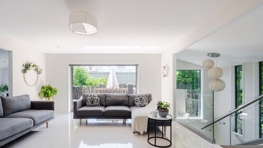
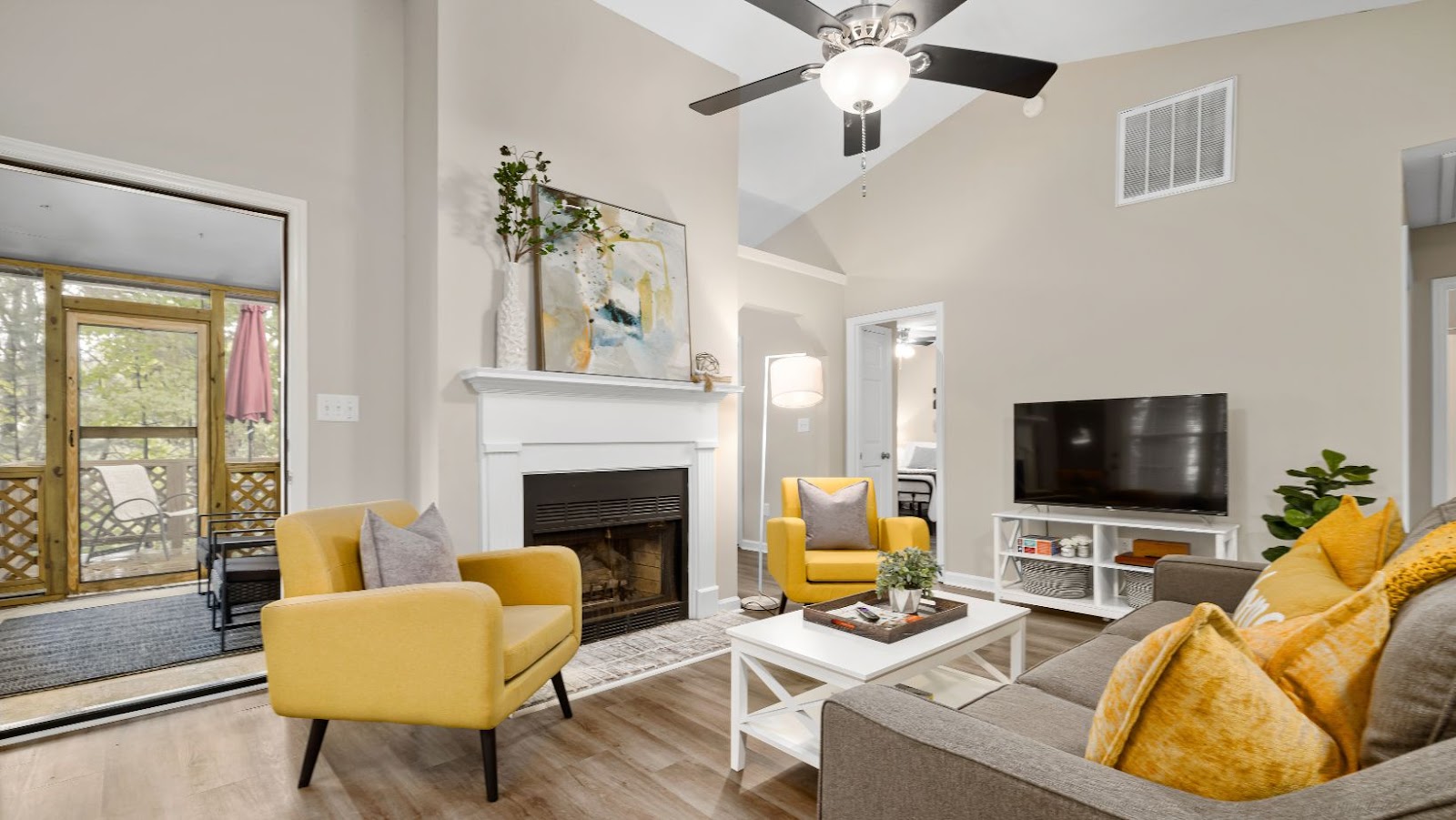
According to Lisa Ockinga, Chief Product Officer at Ling, “The first step in choosing a color palette is to consider the purpose and mood of each room. Colors significantly impact our emotions and can influence how we feel in a space. For example, bedrooms are typically places of relaxation, so calming colors like soft blues, greens, and neutrals are ideal. In contrast, living rooms and kitchens, often the heart of social gatherings, can benefit from warmer, more vibrant colors like reds, oranges, and yellows. Understanding the mood you want to create in each room can guide your color choices and help create a cohesive flow throughout your home.”
Harmonizing with Existing Elements
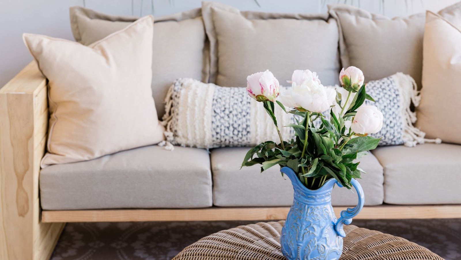
Another important factor to consider is the existing elements in your home, such as furniture, flooring, and fixtures. These elements can serve as a starting point for your color palette. For instance, if you have a beautiful wooden floor with warm undertones, you might choose colors that complement the wood, such as rich earth tones or muted greens.
Similarly, if you have a statement piece of furniture or artwork, you can draw colors from that piece to create a coordinated look. Paying attention to these existing elements ensures that your chosen colors harmonize with your decor.
The Impact of Lighting on Color
“Lighting also plays a crucial role in how colors appear in a room. Natural light changes throughout the day, altering the perception of colors. North-facing rooms have cooler, softer light, making colors appear more muted. You might opt for warmer shades to balance the cool light in these rooms. Conversely, south-facing rooms benefit from warm, intense sunlight, which can enhance bold and vibrant colors. Additionally, artificial lighting, such as LED or incandescent bulbs, can cast different tones on your walls, so it’s important to test your color choices under various lighting conditions to ensure they look good at all times of the day” says, Arman Minas, Director at Armstone
Creating a Cohesive Color Scheme
Finally, creating a cohesive color palette involves choosing a primary color and selecting complementary or contrasting shades to enhance the overall scheme. A common approach is the 60-30-10 rule: 60% of the room’s color is the dominant hue (usually on walls), 30% is a secondary color (often found in upholstery or curtains), and 10% is an accent color (used for accessories and decor items).
This rule helps maintain balance and ensures that no color overwhelms the space. Additionally, consider using a color wheel to find harmonious color combinations, such as analogous colors (next to each other on the wheel) or complementary colors (opposite each other on the wheel).
Conclusion
In conclusion, choosing the perfect color palette for your home involves thoughtful consideration of the mood you want to create, your space’s existing elements, and the lighting’s impact. By understanding these factors and using a balanced approach to color selection, you can create a harmonious and visually appealing environment that reflects your style. Remember to test colors in different lighting conditions and trust your instincts to find the palette that makes your home feel right.